
Bandai Namco Changed Its Logo And Fans Think It Kinda Sucks
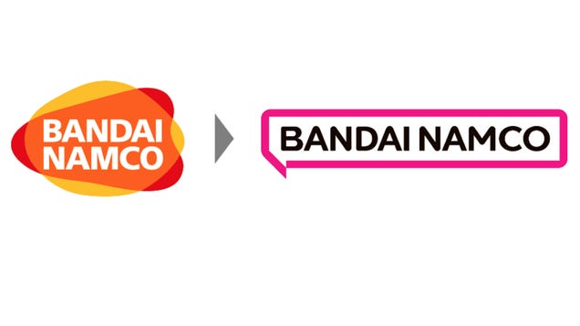
In 2005, Bandai and Namco merged, and the following year, Bandai Namco was born. To mark the new conglomerate, the company got a yellow, red, and orange logo with the company’s name in white font. It’s not a bad look, and stands out among Japanese game companies. But next year, Bandai Namco is getting a redesigned logo, and so far, the buzz is not good.
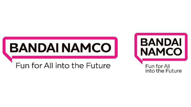
According to Bandai Namco, there is a reason for the redesign—namely that the new logo reflects the company’s new purpose.
“Fundamental to our Purpose is the idea of connecting and working together to create things,” said Bandai Namco Holdings president Masaru Kawaguchi Bandai. “Namco’s entertainment connects fans all over the world. By delivering fun to the people everywhere, we put smiles on their faces and help them achieve happiness. That’s why Bandai Namco exists.”
Source: Kotaku
Comments
Log in to your account or create one for free on MG Community to participate in comments.